Utrecht Ballroom Scene
Utrecht Ballroom Scene
Utrecht Ballroom Scene
A Study in Cultural Stewardship and Digital Infrastructure
A Study in Cultural Stewardship and Digital Infrastructure
Client
Ballroom Works
Role
Brand Designer & Digital Designer
Year
2023 - NOW
project type
Brand design
Web Design
Deliverable
Brand identity
Website
Final product
Client
Ballroom Works
Role
Brand Designer & Digital Designer
Year
2023 - NOW
project type
Brand design
,
Web Design
Deliverable
Brand identity
,
Website
Final product
Overview
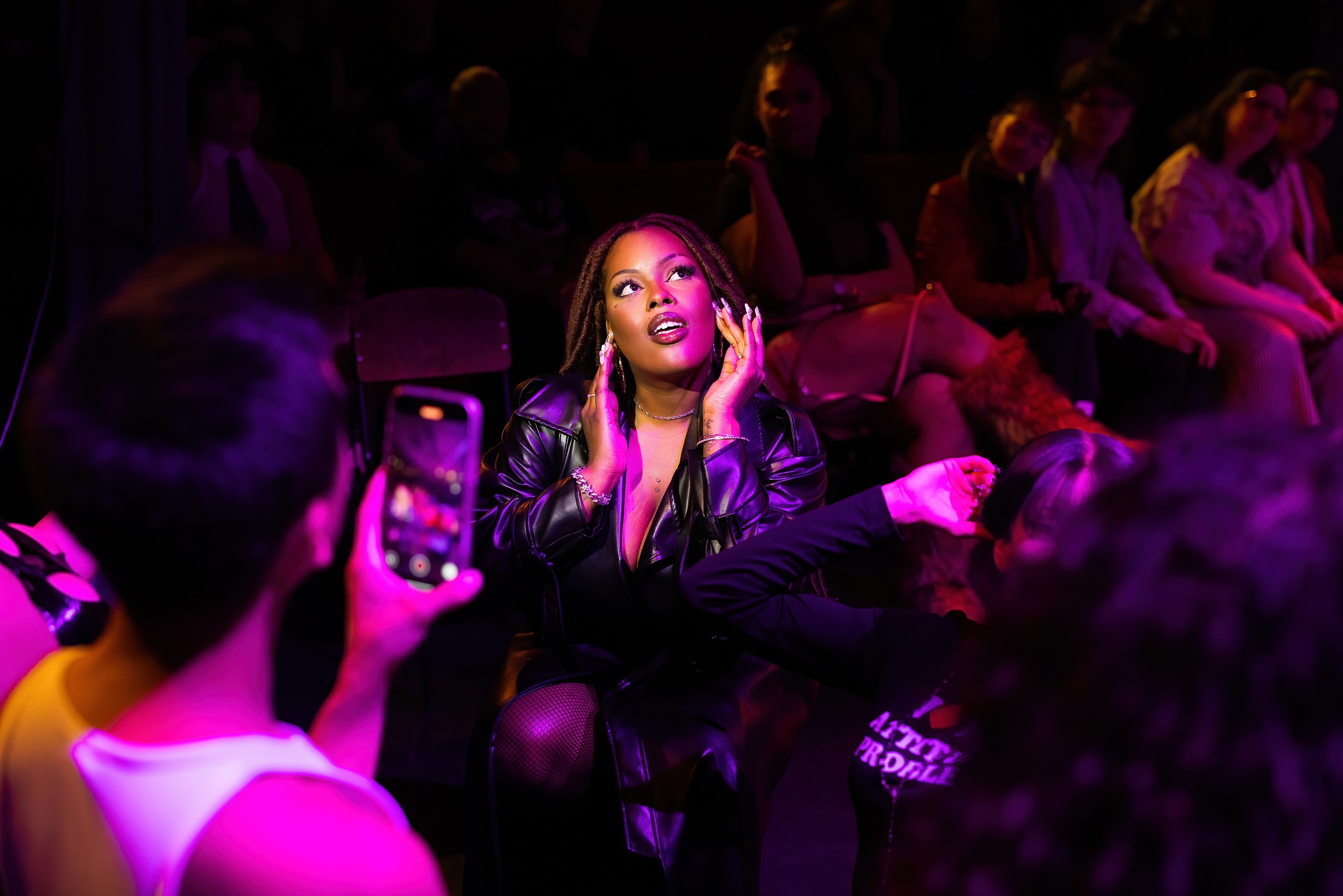
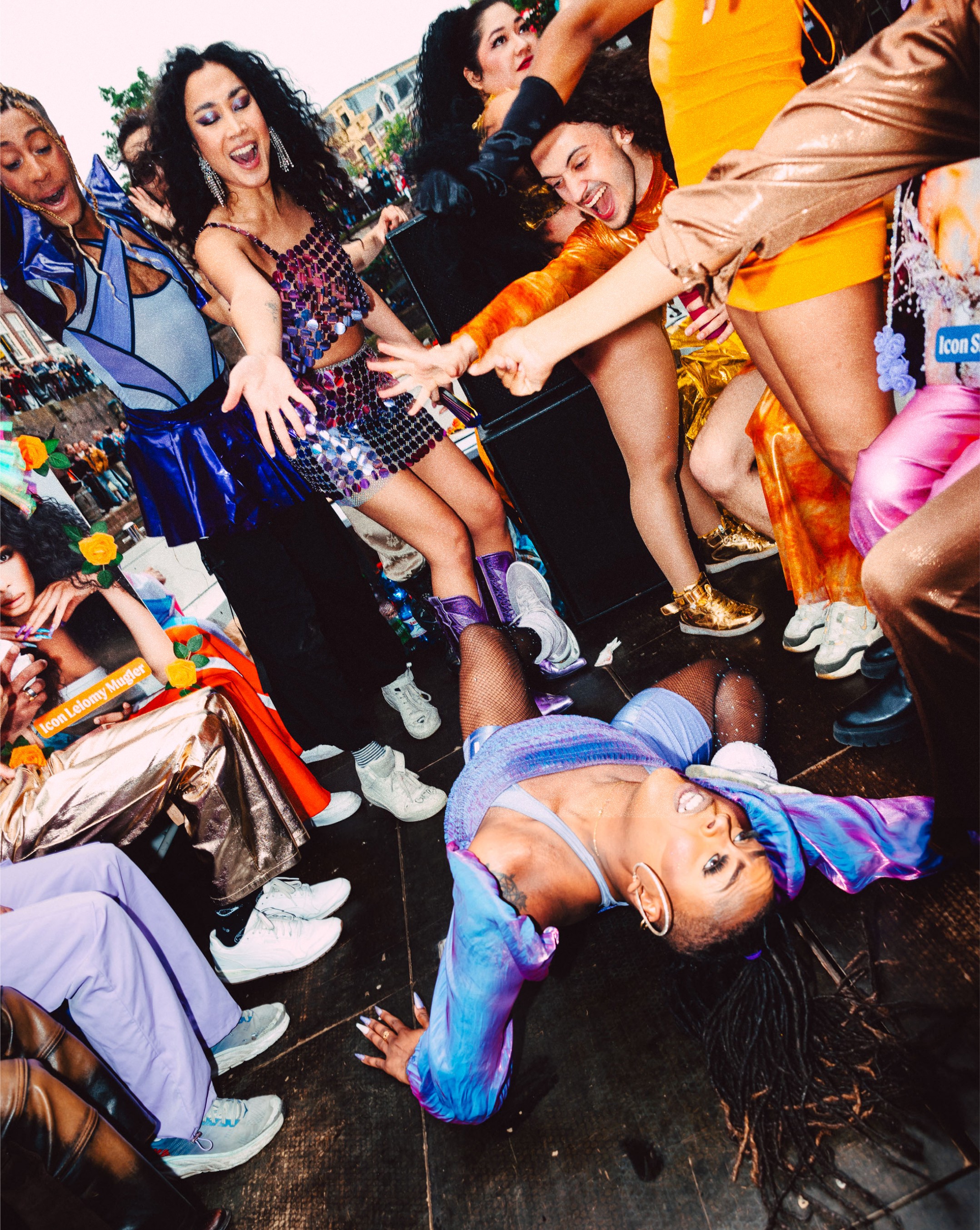
Ballroom is not a trend. It is a lineage, a rigorous discipline, and a sanctuary rooted in queer and trans Black and Brown history. When I began working with the Utrecht Ballroom Scene (UBS), the community was expanding. What started as an independent branding project eventually followed me to Miyagami. After joining the studio, I transitioned the work into a pro bono partnership. This wasn't just about charity. It was about ensuring that a grassroots movement had access to the same caliber of design thinking as a global institution without losing its soul to a corporate agency lens.
Challenge
The trap many designers fall into when approaching ballroom is "spectacle." They lean into the flash and the performance, which often flattens the culture into a caricature. The real challenge was to build a visual and digital language that respected the discipline behind the dance. UBS needed a platform that served two masters: the community members who required functional event data and the newcomers who needed a clear, respectful entry point into the culture.
Approach
I viewed my role as a translator rather than an interpreter. To interpret is to add your own bias. To translate is to carry the meaning across a border with its integrity intact. Every decision was measured against the values of the scene. We prioritized presence over noise and clarity over decoration.
Role
I didn’t approach this as an outside consultant. I am a member of the Utrecht Ballroom Scene. My role was defined by a dual accountability: to the rigorous standards of my craft and to the community I call home. I led the initial brand identity as an independent designer, and later, upon joining Miyagami, I negotiated a pro bono partnership to bring the studio’s technical weight to the scene. I acted as the bridge between the lived experience of the community and the studio’s digital output. My job was to ensure that the technical execution never drifted from the cultural requirements of the house.
Overview
Ballroom is not a trend. It is a lineage, a rigorous discipline, and a sanctuary rooted in queer and trans Black and Brown history. When I began working with the Utrecht Ballroom Scene (UBS), the community was expanding. What started as an independent branding project eventually followed me to Miyagami. After joining the studio, I transitioned the work into a pro bono partnership. This wasn't just about charity. It was about ensuring that a grassroots movement had access to the same caliber of design thinking as a global institution without losing its soul to a corporate agency lens.
Challenge
The trap many designers fall into when approaching ballroom is "spectacle." They lean into the flash and the performance, which often flattens the culture into a caricature. The real challenge was to build a visual and digital language that respected the discipline behind the dance. UBS needed a platform that served two masters: the community members who required functional event data and the newcomers who needed a clear, respectful entry point into the culture.
Approach
I viewed my role as a translator rather than an interpreter. To interpret is to add your own bias. To translate is to carry the meaning across a border with its integrity intact. Every decision was measured against the values of the scene. We prioritized presence over noise and clarity over decoration.
Role
I didn’t approach this as an outside consultant. I am a member of the Utrecht Ballroom Scene. My role was defined by a dual accountability: to the rigorous standards of my craft and to the community I call home. I led the initial brand identity as an independent designer, and later, upon joining Miyagami, I negotiated a pro bono partnership to bring the studio’s technical weight to the scene. I acted as the bridge between the lived experience of the community and the studio’s digital output. My job was to ensure that the technical execution never drifted from the cultural requirements of the house.

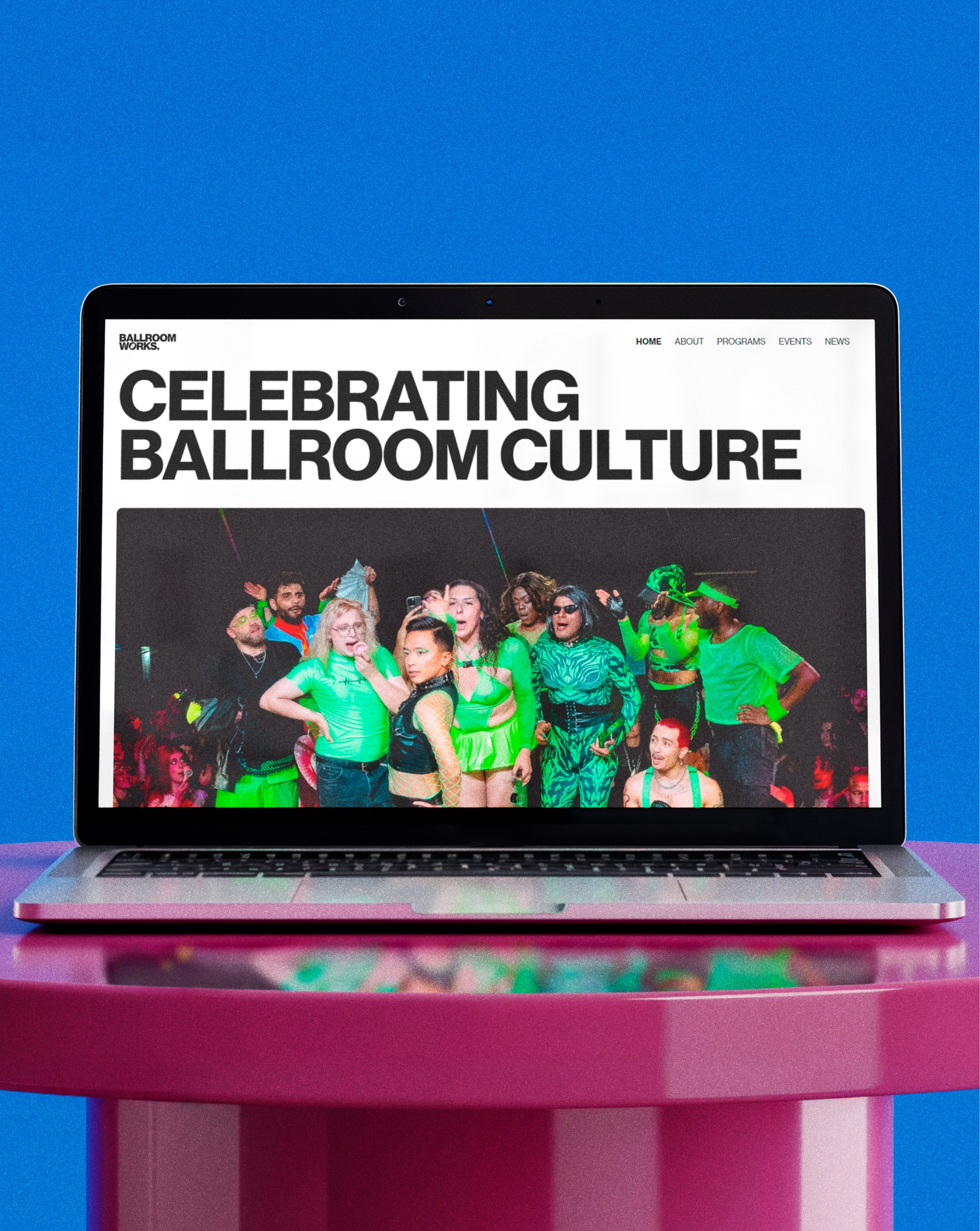
Design process
Cultural Grounding: I spent time in the history, the categories, and the etiquette. You cannot design for a community you do not listen to.
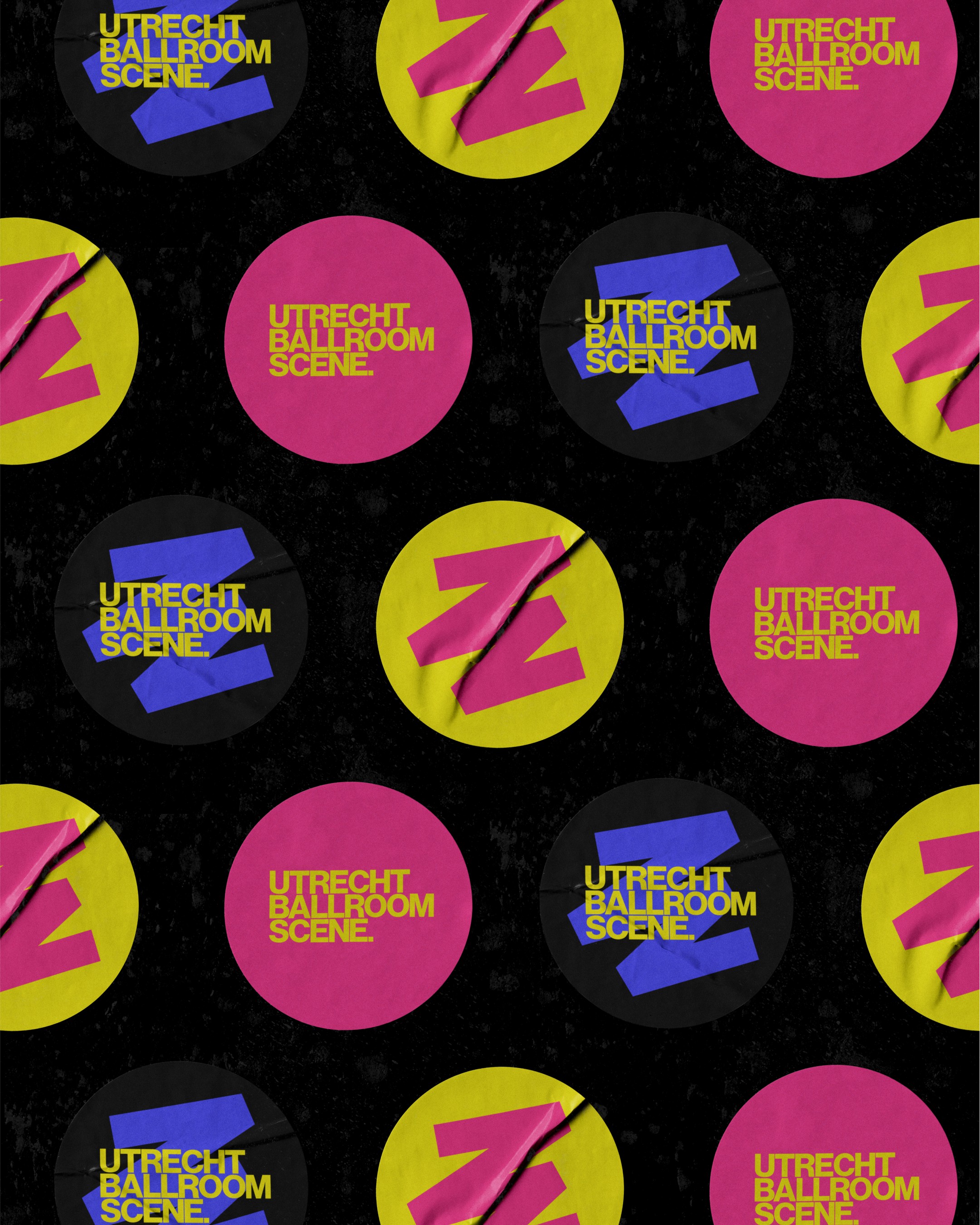
The Typographic System: We chose a high-contrast, authoritative typographic hierarchy. It mirrors the performative structure of a ball: structured, rhythmic, and commanding.
A Poster-Based Language: The graphic system relies on a modular, grid-heavy layout. It allows the identity to scale across social media and physical spaces while maintaining a consistent "editorial" voice.
Structural Integrity: When we moved the project to Miyagami, we focused on Information Architecture. We organized the site around education and accessibility, stripping away the friction for those unfamiliar with the scene.
Implementation: We built the platform in Webflow to ensure the community had a stable, responsive, and easily updatable home.
Design tool
Figma, Webflow
Key design decision
Typographic Authority We leaned into heavy, deliberate type. In a world that often tries to soften queer identities, we chose a visual language that felt permanent and unshakeable.
Intentional Restraint I made a conscious choice to avoid the "rainbow-washing" or neon-drenched aesthetics often associated with queer spaces. We favored a refined, monochromatic-led palette that allows the community’s own photography and energy to provide the color.
Infrastructure over Spectacle The website is a tool, not a trophy. The navigation is dead simple. The event calendars are prominent. The history is legible. We built a house for the community to live in, not a gallery for outsiders to stare at.
Design process
Cultural Grounding: I spent time in the history, the categories, and the etiquette. You cannot design for a community you do not listen to.
The Typographic System: We chose a high-contrast, authoritative typographic hierarchy. It mirrors the performative structure of a ball: structured, rhythmic, and commanding.
A Poster-Based Language: The graphic system relies on a modular, grid-heavy layout. It allows the identity to scale across social media and physical spaces while maintaining a consistent "editorial" voice.
Structural Integrity: When we moved the project to Miyagami, we focused on Information Architecture. We organized the site around education and accessibility, stripping away the friction for those unfamiliar with the scene.
Implementation: We built the platform in Webflow to ensure the community had a stable, responsive, and easily updatable home.
Design tool
Figma, Webflow
Key design decision
Typographic Authority We leaned into heavy, deliberate type. In a world that often tries to soften queer identities, we chose a visual language that felt permanent and unshakeable.
Intentional Restraint I made a conscious choice to avoid the "rainbow-washing" or neon-drenched aesthetics often associated with queer spaces. We favored a refined, monochromatic-led palette that allows the community’s own photography and energy to provide the color.
Infrastructure over Spectacle The website is a tool, not a trophy. The navigation is dead simple. The event calendars are prominent. The history is legible. We built a house for the community to live in, not a gallery for outsiders to stare at.

Result
UBS now exists with a visual presence that matches its cultural weight. The transition to a pro bono studio project provided the community with a high-end digital home that is sustainable for the long term. The brand has become a point of pride, acting as a signal of professional standards within a grassroots movement.
Key learning
Proximity is the ultimate design tool. When you are part of the community you serve, the stakes are no longer theoretical. You aren't guessing at "user needs." You are building the floor you and your chosen family will walk on. I learned that the most radical thing a designer can do for their own culture is to provide it with the same level of architectural excellence usually reserved for global institutions.
Designing from the inside taught me that the goal is not to "explain" the culture to the world. The goal is to build a home so sturdy that the community doesn't have to worry about the roof. Design is a form of care. When it is done with clarity and respect, it becomes a permanent foundation for growth.
Conclusion
The Utrecht Ballroom Scene project proves that brand identity can function as infrastructure. By moving from a solo endeavor to a studio-backed initiative, we demonstrated how design can support the continuity of a culture without diluting its power.


AVAILABLE FOR WORK
LET'S TALK SO SAY HELLO
LET'S TALK SO SAY HELLO
LET'S TALK SO SAY HELLO
LET'S TALK SO SAY HELLO
LET'S TALK SO SAY HELLO
LET'S TALK SO SAY HELLO
LET'S TALK SO SAY HELLO
LET'S TALK SO SAY HELLO
LET'S TALK SO SAY HELLO
AVAILABLE FOR WORK
LET'S TALK SO SAY HELLO
LET'S TALK SO SAY HELLO
LET'S TALK SO SAY HELLO
LET'S TALK SO SAY HELLO
LET'S TALK SO SAY HELLO
LET'S TALK SO SAY HELLO
LET'S TALK SO SAY HELLO
LET'S TALK SO SAY HELLO
LET'S TALK SO SAY HELLO
AVAILABLE FOR WORK
LET'S TALK SO SAY HELLO
LET'S TALK SO SAY HELLO
LET'S TALK SO SAY HELLO
LET'S TALK SO SAY HELLO
LET'S TALK SO SAY HELLO
LET'S TALK SO SAY HELLO
LET'S TALK SO SAY HELLO
LET'S TALK SO SAY HELLO
LET'S TALK SO SAY HELLO