SPIL
SPIL
SPIL
Systematizing Editorial Conviction for a New National News Cycle
Systematizing Editorial Conviction for a New National News Cycle
Client
Client
Role
Digital Designer
Year
2024
project type
Web Design
UX/UI
Deliverable
Website
Final product
Client
Client
Role
Digital Designer
Year
2024
project type
Web Design
,
UX/UI
Deliverable
Website
,
Final product
Overview
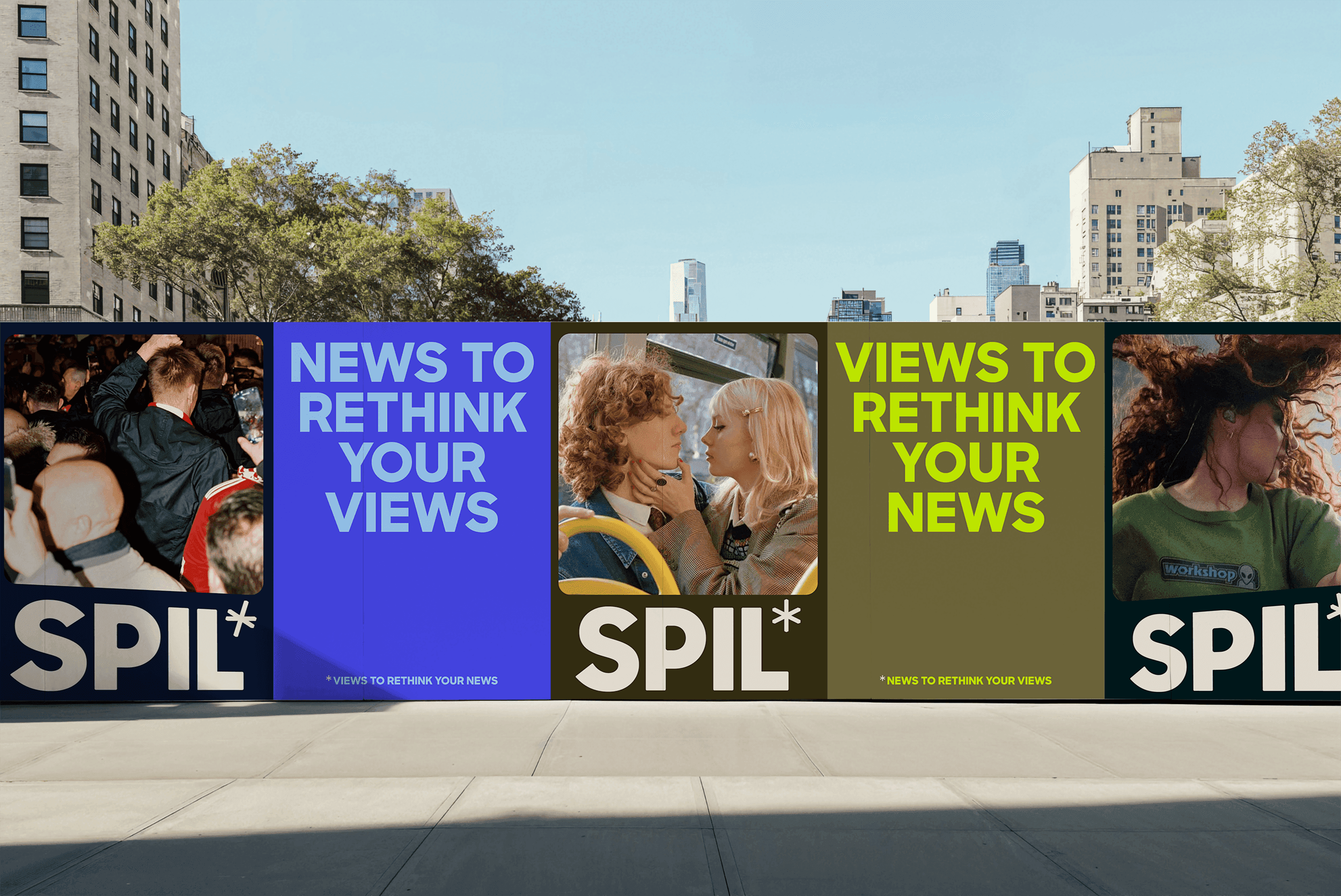
SPIL arrived as a provocation. It was a Gen Z news platform with a national reach in the Netherlands, possessing a raw editorial stance and a foundational visual identity. My task was to take that spark and build the engine. This wasn't a matter of simply placing a logo on a website. It was about defining how SPIL operates in a digital-first world, turning a static brand into a living, breathing editorial platform.
Challenge
The existing identity had plenty of attitude but lacked a formal system. It was graphic and loud, yet it hadn't been tested against the rigors of a news cycle. There were no rules for typographic hierarchy, no logic for pacing, and no consideration for how the brand should move. The tension lay in maintaining that raw, almost print-like edge while ensuring the site remained a functional, high-traffic utility that could scale across devices without losing its soul.
Approach
I treated the website as the point where the brand becomes operational. Instead of looking for new visual gimmicks, I focused on the architecture. My approach was to find the rhythm in the white space and the authority in the type, ensuring that the digital system felt like a natural extension of SPIL’s editorial voice.
Role
As Web Designer and Art Director, I was responsible for the digital identity and the mechanical logic of the site. I led the layout systems, interaction design, and motion direction. My role also involved acting as a translator between the visual intent and the development team, ensuring that the final build moved with the same intentionality I saw on the canvas
Overview
SPIL arrived as a provocation. It was a Gen Z news platform with a national reach in the Netherlands, possessing a raw editorial stance and a foundational visual identity. My task was to take that spark and build the engine. This wasn't a matter of simply placing a logo on a website. It was about defining how SPIL operates in a digital-first world, turning a static brand into a living, breathing editorial platform.
Challenge
The existing identity had plenty of attitude but lacked a formal system. It was graphic and loud, yet it hadn't been tested against the rigors of a news cycle. There were no rules for typographic hierarchy, no logic for pacing, and no consideration for how the brand should move. The tension lay in maintaining that raw, almost print-like edge while ensuring the site remained a functional, high-traffic utility that could scale across devices without losing its soul.
Approach
I treated the website as the point where the brand becomes operational. Instead of looking for new visual gimmicks, I focused on the architecture. My approach was to find the rhythm in the white space and the authority in the type, ensuring that the digital system felt like a natural extension of SPIL’s editorial voice.
Role
As Web Designer and Art Director, I was responsible for the digital identity and the mechanical logic of the site. I led the layout systems, interaction design, and motion direction. My role also involved acting as a translator between the visual intent and the development team, ensuring that the final build moved with the same intentionality I saw on the canvas


Design process
Interrogating the Brand: I started by breaking down the existing assets to find the core DNA. I then translated those tonal qualities into a set of digital-first rules for scale, contrast, and typographic behavior.
The Modular Editorial System: I developed a layout grid that favors bold, typographic anchors and clear blocks of content. This creates a sense of confidence and allows the news to feel urgent and structured.
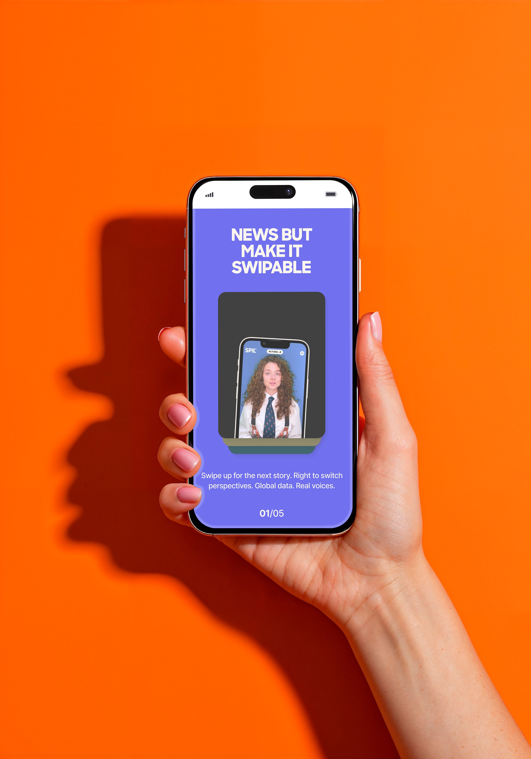
Mobile as the Primary Canvas: For this demographic, the mobile experience is the only experience. Every decision regarding hierarchy and interaction started on the phone and was expanded to the desktop with deliberate care.
Functional Motion: I used GSAP to build a motion language that feels cohesive. Motion in this context isn't decoration. It is a tool to guide the eye and reinforce the hierarchy of information.
Directorial Implementation: I maintained a tight feedback loop with the developers. We focused on the nuances of easing and timing to ensure the site felt fluid and responsive rather than mechanical.
Design tool
Figma served as our structural laboratory for the system design. We used GSAP to define the behavior and interaction of the interface. The most important tool, however, was the continuous collaboration between design and engineering to ensure the vision survived the build.
Key design decision
Rhythm Over Ornament We relied on the pacing of the content and the strength of the layout to carry the brand. We avoided "web-native" trends that would have diluted the editorial authority.
Typographic Anchoring The type does the heavy lifting. By using aggressive scales and high-contrast weights, the platform gains an immediate sense of stature.
The Utility of Restraint We chose to build hierarchy through spacing and scale rather than a clutter of colors. This allows the journalism to be the hero while the brand remains the unmistakable framework.
Intentional Transitions Every interaction was designed to feel like a page turn in a high-end magazine. Motion was used to create a seamless reading flow that respects the user's attention.
Design process
Interrogating the Brand: I started by breaking down the existing assets to find the core DNA. I then translated those tonal qualities into a set of digital-first rules for scale, contrast, and typographic behavior.
The Modular Editorial System: I developed a layout grid that favors bold, typographic anchors and clear blocks of content. This creates a sense of confidence and allows the news to feel urgent and structured.
Mobile as the Primary Canvas: For this demographic, the mobile experience is the only experience. Every decision regarding hierarchy and interaction started on the phone and was expanded to the desktop with deliberate care.
Functional Motion: I used GSAP to build a motion language that feels cohesive. Motion in this context isn't decoration. It is a tool to guide the eye and reinforce the hierarchy of information.
Directorial Implementation: I maintained a tight feedback loop with the developers. We focused on the nuances of easing and timing to ensure the site felt fluid and responsive rather than mechanical.
Design tool
Figma served as our structural laboratory for the system design. We used GSAP to define the behavior and interaction of the interface. The most important tool, however, was the continuous collaboration between design and engineering to ensure the vision survived the build.
Key design decision
Rhythm Over Ornament We relied on the pacing of the content and the strength of the layout to carry the brand. We avoided "web-native" trends that would have diluted the editorial authority.
Typographic Anchoring The type does the heavy lifting. By using aggressive scales and high-contrast weights, the platform gains an immediate sense of stature.
The Utility of Restraint We chose to build hierarchy through spacing and scale rather than a clutter of colors. This allows the journalism to be the hero while the brand remains the unmistakable framework.
Intentional Transitions Every interaction was designed to feel like a page turn in a high-end magazine. Motion was used to create a seamless reading flow that respects the user's attention.
Result
The outcome is a digital-first news platform that feels as opinionated as the content it hosts. SPIL now has a scalable system that translates its raw energy into a sophisticated, usable experience. It stands as a contemporary news entity that understands its own voice and knows exactly how to show up on a screen.
Key learning
A brand is only as strong as its behavior. In digital design, restraint is often more powerful than expression. A bold identity doesn't need more noise; it needs a better system to hold the volume.
Conclusion
SPIL demonstrates that a news platform can have a strong editorial conviction without sacrificing clarity. By building a digital system rooted in rhythm and typographic authority, we ensured that the platform became an essential part of the message itself.
AVAILABLE FOR WORK
LET'S TALK SO SAY HELLO
LET'S TALK SO SAY HELLO
LET'S TALK SO SAY HELLO
LET'S TALK SO SAY HELLO
LET'S TALK SO SAY HELLO
LET'S TALK SO SAY HELLO
LET'S TALK SO SAY HELLO
LET'S TALK SO SAY HELLO
LET'S TALK SO SAY HELLO
AVAILABLE FOR WORK
LET'S TALK SO SAY HELLO
LET'S TALK SO SAY HELLO
LET'S TALK SO SAY HELLO
LET'S TALK SO SAY HELLO
LET'S TALK SO SAY HELLO
LET'S TALK SO SAY HELLO
LET'S TALK SO SAY HELLO
LET'S TALK SO SAY HELLO
LET'S TALK SO SAY HELLO
AVAILABLE FOR WORK
LET'S TALK SO SAY HELLO
LET'S TALK SO SAY HELLO
LET'S TALK SO SAY HELLO
LET'S TALK SO SAY HELLO
LET'S TALK SO SAY HELLO
LET'S TALK SO SAY HELLO
LET'S TALK SO SAY HELLO
LET'S TALK SO SAY HELLO
LET'S TALK SO SAY HELLO